Locally Engaged
.png)
Overview
Government websites provide critical information and services that affect people’s lives on a daily basis and it is their responsibility to present that information in a way that meets the users (citizens) needs.
Project Goal
Our stakeholders have tasked us with creating another web-based product to bridge the gap between the constituents and their government.
Target Audience
Wide range of key users from different demographics.
My Role
UX Designer, UX Researcher,
UI Leader
Project
Team Project
Timeline
5 Weeks (2020)
Tools
Figma, InVision, Miro, Slack,
G Suite, Xtensio, Trello
Problem Statement
The motivated constituent needs an efficient tool to find information that will encourage them to engage in their local government so that they feel better represented.
Before Starting
To align our thought and find out how we can increase civic engagement, we had to define what civic engagement is:
“Contributing to public life and participating in solving public problems.”
Research and Discovery
Competitors Analysis

Following our research into the government greatest competitors, we were able to see that:
-
People get more connected to their local government people through social media than through their websites
-
Governmental websites are not civic engagement-focused
-
It's hard to find specific information on Governmental website
SME, User Interview & Survey Findings
.png)
Government websites are difficult to navigate which prevents engagement

Many participants shared the view that they did not feel heard by my local officials.

Constitutions prefer digital activism (micro-engaging) and stick to reposting on social media, sending emails from templates, and signing petitions.
.png)
Participants want to be more engaged with their local government/politics however they don’t know how to start or find information to help them engage.
Persona
Let's meet Hanna Brooks

Ideating
Each of our team members came up with one design concept that had 2 commonalities:
-
Micro-Engagements
-
Local Focused
The 3 concepts:
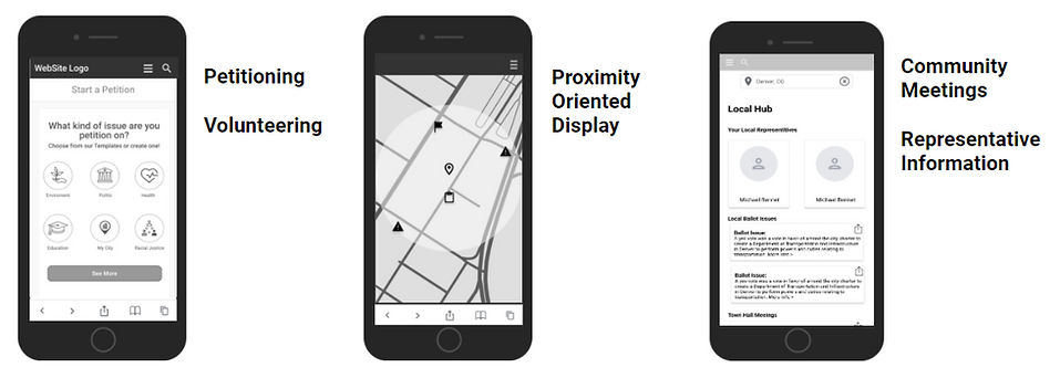
The petitioning/volunteering concept was brought from me to the team:
.png)
After we shared our concepts, we priories the terms based on Hanna's needs and merge them to one concept.
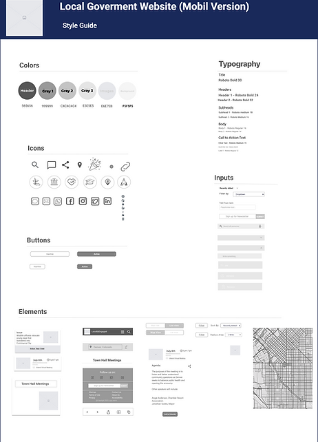
Style Guide
I created a Style Guide for my team to keep our visual identity of our interface consistent.
Usability Testing & Iterating
-
A sum of our usability testing were:
-
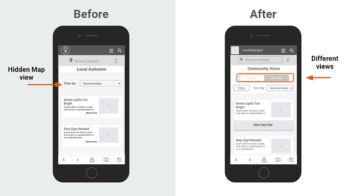
User had a hard time to find the map! -> We created a Toggle the map view and the list view
-
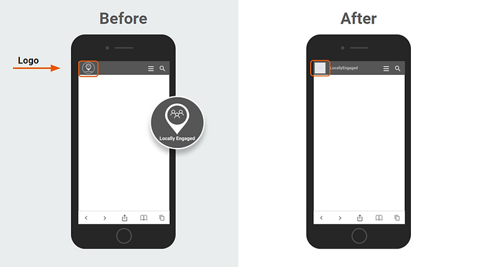
All the user click on our Logo while they were supposes to find the map -> We changed our logo with a placeholder for now till we create an other Logo to avoid the misleading
-
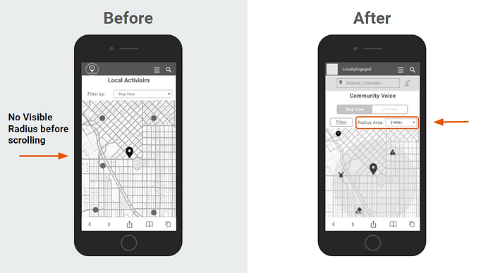
Users also mentioned that they like to have a radios in their map view so they can use it as filter to limit the range they want to search.
-
Based on the testing synthesis, we iterate on the design before moving into mid fidelity design


Reflections
-
My biggest challenge on this project was that as a new immigrant to the US I had no clue about the US-Government and its structure. To could continue working on this project I had to inform myself and collect information about the governmental structure, which I could achieve very in time and well to could continue interviewing constituents and follow their saying and needs.
-
A main takeaway for me is choosing the right logos or icon on a website or an app is very important so that the users don't get mislead or irritated.
-
If I had more time working on that project I would conduct another round of usability testing with a more open format, rather than a specifically task-based format, in order to locate more areas of improvement.